Typography
.display-1
Heading 1
.h1
Heading 2
.h2
.h2-alt
Heading 3
.h3
Heading 4
.h4
.h4-alt
Heading 5
.h5
Heading 6
.label
.subhead
.text-large
Paragraph
.text-small
.caption
.text-white
.text-black
.text-blue
.fw-bold
.fw-semibold
.fw-medium
.text-center
.text-center-m
.text-center-sm
.text-center-xs
.block-xs
.hidden
.overflow-hidden
.hidden
.show-m
.show-sm
.show-xs
Buttons
.btn.btn.yellow
Thank you! Your submission has been received!
Oops! Something went wrong while submitting the form.
Getting Started
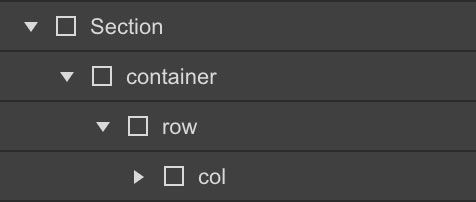
Columns need to be nested within a "row" and a direct child of a "container". All columns start off at equal-widths by defining the class of "col" and auto-collapse at the mobile portrait breakpoint if no responsive classes are defined.
col
col
col
col
col
col
col
col
col
col
Remove Gutters
To remove all padding from columns, use the "no-gutters" class preceded by the initial class of "col".

no-gutters
no-gutters
no-gutters
no-gutters
Full Width Container
Define your div with a class of "container-fluid" for full width.

col
col
col
col
Responsive Grid
Grid - Desktop
To define our 12 column grid, all classes must precede with the initial class of "col"

col-1
col-11
col-2
col-10
col-3
col-9
col-4
col-8
col-5
col-7
col-6
col-6
col-12
Grid - Tablet (Breakpoint)
Defining our tablet breakpoints, all classes must precede with the class of "col" and if defined, your desktop class of "col-(1-12)"

col-m-1
col-m-11
col-m-2
col-m-10
col-m-3
col-m-9
col-m-4
col-m-8
col-m-5
col-m-7
col-m-6
col-m-6
col-m-12
Grid - Mobile Landscape (Breakpoint)
Defining our tablet breakpoints, all classes must precede with the class of "col" and if defined, your desktop and tablet classes of "col-(1-12)"

col-sm-1
col-sm-11
col-sm-2
col-sm-10
col-sm-3
col-sm-9
col-sm-4
col-sm-8
col-sm-5
col-sm-7
col-sm-6
col-sm-6
col-sm-12
Grid - Mobile Portrait (Breakpoint)
Defining our tablet breakpoints, all classes must precede with the class of "col" and if defined, your desktop, tablet and mobile landscape classes of "col-(1-12)"

col-xs-1
col-xs-11
col-xs-2
col-xs-10
col-xs-3
col-xs-9
col-xs-4
col-xs-8
col-xs-5
col-xs-7
col-xs-6
col-xs-6
col-xs-12
Column Wrapping
If responsive columns are placed within a single row and which the total result in greater then 12, they will automatically wrap onto a new line.
col-4
col-8
col-6
col-6
col-3
col-2
col-7
Reverse Wrapping (on tablet and mobile)
Use the 'reverse-on-m' combo class on the 'row' element to reverse it on tablet. Use the 'reverse-on-sm' combo class on the 'row' element to reverse it on mobile.
col-4
col-8
col-8
col-4
Vertical Alignment
Align-Start
To align columns from the top, combine a class of "align-start" preceded by the class of "row"

align-start
align-start
align-start
Align-Center
To align columns from the center, combine a class of "align-center" preceded by the class of "row"

align-center
align-center
align-center
Align-End
To align columns from the bottom, combine a class of "align-end" preceded by the class of "row"

align-end
align-end
align-end
Horizontal Alignment
Justify-Start
To align columns from the left, combine a class of "justify-start" preceded by the by class of "row"

justify-start
justify-start
Justify-Center
To align columns from the right, combine a class of "justify-center" preceded by the class of "row"

justify-center
justify-center
Justify-End
To align columns from the right, combine a class of "justify-end" preceded by the class of "row"

justify-end
justify-end
Justify-Between
To evenly space columns between each-other, combine a class of "justify-between" preceded by the class of "row"

justify-between
justify-between
Justify-Around
To evenly space columns around each-other, combine a class of "justify-around" preceded by the class of "row"

justify-around
justify-around
Self-Align Columns
To individually self-align columns, combine a class of "self-start", "self-center", "self-end" preceded by the by class of "col"

self-start
self-center
self-end
Column Reordering
To individually reorder columns, combine a class of either "order-first", "order-last", preceded by the by class of "col"

order-last
order-first
